CloudPass LogoCloud Pass
AWSGoogle CloudMicrosoftCiscoCompTIADatabricks
Certifications
AWSGoogle CloudMicrosoftCiscoCompTIADatabricks
PL-300: Microsoft Power BI Data Analyst

Practice Test #3

Simuliere die echte Prüfungserfahrung mit 50 Fragen und einem Zeitlimit von 100 Minuten. Übe mit KI-verifizierten Antworten und detaillierten Erklärungen.

50Fragen100Minuten700/1000Bestehensgrenze
Übungsfragen durchsuchen

KI-gestützt

Dreifach KI-verifizierte Antworten & Erklärungen

Jede Antwort wird von 3 führenden KI-Modellen kreuzverifiziert, um maximale Genauigkeit zu gewährleisten. Erhalte detaillierte Erklärungen zu jeder Option und tiefgehende Fragenanalysen.

GPT Pro
Claude Opus
Gemini Pro
Erklärungen zu jeder Option
Tiefgehende Fragenanalyse
Konsensgenauigkeit durch 3 Modelle

Übungsfragen

1
Frage 1

You are creating a report in Power BI Desktop. You load a data extract that includes a free text field named coll. You need to analyze the frequency distribution of the string lengths in col1. The solution must not affect the size of the model. What should you do?

A DAX calculated column using LEN(col1) would enable a histogram of lengths, but calculated columns are materialized and stored in the model. That increases model size (even if compression reduces impact). The requirement explicitly says the solution must not affect model size, so adding a stored column is not appropriate.

A DAX measure to calculate average length (for example, AVERAGEX over LEN) would not increase model size, but it does not provide a frequency distribution of lengths. An average is a single aggregate value and cannot show how many rows have each length without additional structures (like a length column or a disconnected table).

Adding a length column in Power Query (Text.Length) is a common preparation step, but it typically loads into the model and therefore increases model size. Unless you specifically configure it as not loaded (not stated here), this violates the requirement. It also changes the dataset schema rather than just analyzing it.

This is the only option that points to using Power Query Editor’s profiling experience rather than creating a new field in the model. Profiling features are used to inspect data characteristics during preparation and do not persist additional columns into the semantic model. That makes it the best fit for the requirement to analyze the data without affecting model size. Although the wording about grouping specifically by length is imprecise, the intent is clearly to use profiling rather than model changes.

Fragenanalyse

Core concept: This question tests the difference between creating persisted model artifacts and using Power Query’s data profiling tools for exploratory analysis. The requirement is to analyze the frequency distribution of text lengths without increasing model size, so any solution that adds a new column to the model is undesirable. Why correct: Among the options, the only approach that does not add a calculated or transformed column to the model is to use Power Query Editor’s profiling capabilities. Data profiling is intended for inspection and analysis during data preparation and does not create stored model data, so it satisfies the constraint about model size. Key features: DAX calculated columns and Power Query added columns both create per-row values that are loaded into the model unless explicitly excluded. Measures do not store row-level results, but a single aggregate such as average length does not provide a frequency distribution. Power Query profiling features such as Column distribution and Column profile are lightweight analysis tools used to inspect data characteristics without persisting new fields. Common misconceptions: A common mistake is to assume that any length analysis requires adding a LEN/Text.Length column. That works functionally, but it changes the model and can increase memory usage. Another misconception is that a measure like average length can substitute for a distribution, when in reality it only returns a summary statistic. Exam tips: When a PL-300 question says a solution must not affect model size, prefer profiling or report-time logic over persisted columns. Eliminate options that explicitly add columns first. If one remaining option uses Power Query profiling, it is usually the intended answer even if the wording is less precise than the actual UI.

2
Frage 2

Note: This question is part of a series of questions that present the same scenario. Each question in the series contains a unique solution that might meet the stated goals. Some question sets might have more than one correct solution, while others might not have a correct solution. After you answer a question in this section, you will NOT be able to return to it. As a result, these questions will not appear in the review screen. You are modeling data by using Microsoft Power BI. Part of the data model is a large Microsoft SQL Server table named Order that has more than 100 million records. During the development process, you need to import a sample of the data from the Order table. Solution: You write a DAX expression that uses the FILTER function. Does this meet the goal?

Yes is incorrect because DAX FILTER does not act at the data acquisition stage for an Import model. Even if you create a filtered calculated table with DAX, the source data must already exist in the model before DAX can evaluate it. That means the large SQL Server table would still be imported first, defeating the purpose of sampling during development. The correct approach is to sample in Power Query or in the source query so only a subset is loaded.

No is correct because writing a DAX expression that uses FILTER does not help import only a sample from the SQL Server Order table. DAX operates on data after it has already been loaded into the Power BI model, so it cannot limit the rows retrieved from the source during import. To sample data during development, you should use Power Query steps such as Keep Top Rows, filters that fold back to SQL Server, or a native SQL statement. Those approaches reduce the data volume before it is imported, which is the stated goal.

Fragenanalyse

Core concept: This question tests how to retrieve only a sample of rows from a large source table during data import in Power BI. When importing data from SQL Server, sampling must be done in Power Query or at the source query level so that fewer rows are fetched before they enter the model. DAX is evaluated after data is loaded into the model, so a DAX FILTER expression does not reduce the amount of source data imported. A common misconception is thinking DAX can control extraction volume from the source, but DAX works on model data rather than source acquisition. For the exam, remember that row reduction during import is done with Power Query transformations, native SQL queries, or source-side filtering—not with DAX.

3
Frage 3
(2 auswählen)

You have a report that contains four pages. Each page contains slicers for the same four fields. Users report that when they select values in a slicer on one page, the selections are not persisted on other pages. You need to recommend a solution to ensure that users can select a value once to filter the results on all the pages. What are two possible recommendations to achieve this goal? Each correct answer presents a complete solution. NOTE: Each correct selection is worth one point.

Incorrect. Bookmarks capture a saved state of a report page (including slicer selections), but they are static snapshots. Creating a bookmark for each slicer value is not practical for many values and does not allow users to freely select any value once and have it persist dynamically across pages. Bookmarks are better for navigation, storytelling, and toggling predefined views.

Correct. Report-level filters apply to every page in the report. Moving the four fields from slicers to report-level filters ensures a single selection filters all pages consistently. This fully meets the persistence requirement, though it changes the UX from on-canvas slicers to the Filters pane. It’s a valid complete solution when global filtering is the primary goal.

Correct. Sync slicers is specifically designed to keep slicer selections consistent across multiple pages. When you sync slicers for the same field, a selection made on one page is reflected on other pages. You can also control visibility per page, allowing one slicer to drive filtering everywhere without duplicating the visual experience on each page.

Incorrect. Page-level filters only affect visuals on the current page. Even if you configure the same page-level filters on each page, users would still need to set them repeatedly, and selections would not automatically persist when navigating between pages. This does not satisfy the requirement to select once and filter all pages.

Incorrect. Visual-level filters apply only to a single visual, not to all visuals on a page or across pages. Replacing slicers with visual-level filters would fragment the filtering experience and require repeated configuration per visual. It cannot provide a single selection that filters all pages’ content.

Fragenanalyse

Core concept: This question tests how to apply consistent filtering across multiple report pages in Power BI. Slicers are visuals, and by default their selections are page-scoped unless you explicitly synchronize them. Alternatively, filters can be applied at the report level so they affect every page. Why the answers are correct: Syncing slicers across pages (C) is the most direct solution when you want users to interact with a slicer once and have that same selection propagate to slicers on other pages. Using the Sync slicers pane, you can choose which pages are synced and whether the slicer is visible on each page. This preserves the slicer experience and ensures the selection state is shared. Replacing slicers with report-level filters (B) is also a complete solution because report-level filters apply to all pages in the report. If the requirement is “select a value once to filter results on all pages,” a report-level filter satisfies the functional need. While it changes the user experience (filter pane instead of on-canvas slicer), it guarantees persistence across pages without needing multiple slicer visuals. Key features / configuration notes: - Sync slicers: Use View > Sync slicers. Ensure the slicers are based on the same field and that sync is enabled for all relevant pages. You can keep the slicer visible on one page and hidden on others while still syncing. - Report-level filters: Add the field(s) to the Filters pane under “Filters on all pages.” This is especially useful when you want global constraints (e.g., Region, Fiscal Year) consistently applied. Common misconceptions: - Page-level filters (D) only affect a single page, so they do not persist across pages. - Visual-level filters (E) only affect one visual, not the whole page or report. - Bookmarks (A) can capture a state, but they are not a scalable way to persist arbitrary slicer selections across pages; they require predefining states and do not meet the “select once” interactive requirement. Exam tips: Remember the scope hierarchy: visual < page < report. For slicers specifically, “Sync slicers” is the feature designed to share slicer selections across pages while keeping the slicer interaction model.

4
Frage 4

DRAG DROP - You receive revenue data that must be included in Microsoft Power BI reports. You preview the data from a Microsoft Excel source in Power Query as shown in the following exhibit. Column1 Column2 Column3 Column4 Column5 Column6 Valid: 100% Valid: 100% Valid: 100% Valid: 100% Valid: 100% Valid: 100% Error: 0% Error: 0% Error: 0% Error: 0% Error: 0% Error: 0% Empty: 0% Empty: 0% Empty: 0% Empty: 0% Empty: 0% Empty: 0%

Department Product 2016 2017 2018 2019 Bikes Carbon mountainbike 1002815 1006617 1007814 1007239 Bikes Aluminium road bike 1007024 1001454 1005842 1007105 Bikes Touring bike 1003676 1005171 1001669 1003244 Accessories Bell 76713 10247 60590 52927 Accessories Bottle holder 26690 29613 67955 71466 Accessories Satnav 83189 40113 71684 24697 Accessories Mobilephone holder 68641 80336 58099 45706 You plan to create several visuals from the data, including a visual that shows revenue split by year and product. You need to transform the data to ensure that you can build the visuals. The solution must ensure that the columns are named appropriately for the data that they contain. Which three actions should you perform in sequence? To answer, move the appropriate actions from the list of actions to the answer area and arrange them in the correct order. Select and Place:
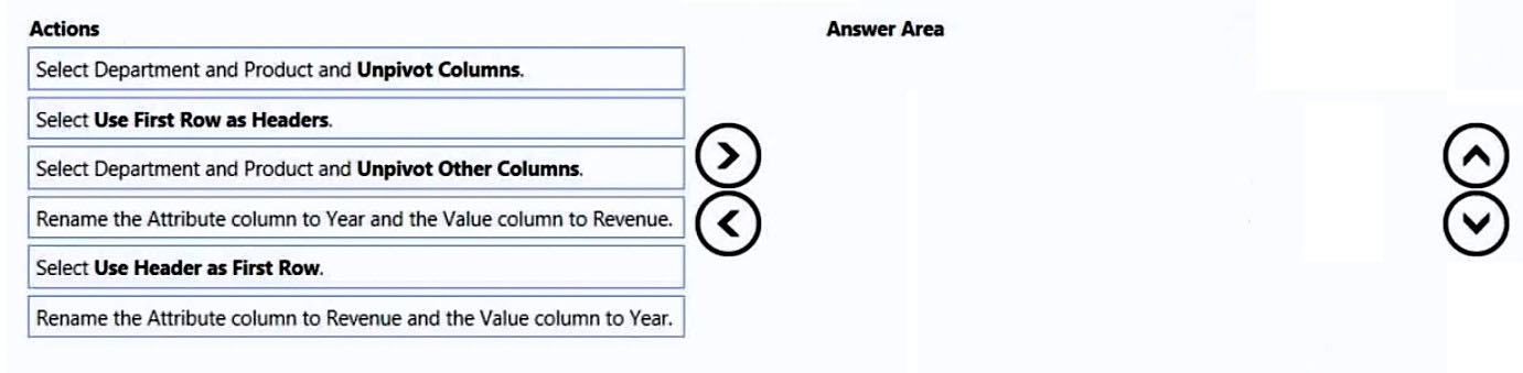
Teil 1:

Select the correct answer(s) in the image below.

question-image

Pass is appropriate because the transformation sequence is determinable from the scenario and the listed actions. The required end state is a long table with columns like Department, Product, Year, Revenue. To get there, you must (1) promote the first row to headers so the year columns are correctly named (2016, 2017, 2018, 2019) rather than Column1–Column6; (2) select Department and Product and use Unpivot Other Columns to convert all year columns into rows (this is preferred over Unpivot Columns because it automatically includes any additional year columns that may appear later); and (3) rename Attribute to Year and Value to Revenue so the columns are semantically correct for modeling and visuals. Therefore, the correct response is that you know the answer (Pass).

5
Frage 5

DRAG DROP - You are modifying a Power BI model by using Power BI Desktop. You have a table named Sales that contains the following fields. Name Data type Transaction ID Whole Number Customer Key Whole Number Sales Date Key Date Sales Amount Whole Number You have a table named Transaction Size that contains the following data. Transaction Size ID | Transaction Size | Min | Max 1 | Small | 0 | 10,000 2 | Medium | 10,001 | 100,000 3 | Large | 100,001 | 999,999,999 You need to create a calculated column to classify each transaction as small, medium, or large based on the value in Sales Amount. How should you complete the code? To answer, drag the appropriate values to the correct targets. Each value may be used once, more than once, or not at all. You may need to drag the split bar between panes or scroll to view content. NOTE: Each correct selection is worth one point. Select and Place:

Teil 1:

Select the correct answer(s) in the image below.

question-image

The calculated column must first capture the current row's Sales value, then identify the matching row in the Transaction Size table where the amount falls between Min and Max. FILTER is required to return the matching range row(s), and AND is required so both boundary conditions are true at the same time. CALCULATE then evaluates DISTINCT('Transaction Size'[Transaction Size]) in the context of that filtered row, returning Small, Medium, or Large. ALL is incorrect because it removes filters rather than applying the range match, OR would match too many rows, and SUM is unnecessary because this is a row-by-row calculated column using the current Sales value.

Möchtest du alle Fragen unterwegs üben?

Lade Cloud Pass herunter – mit Übungstests, Fortschrittsverfolgung und mehr.

6
Frage 6

HOTSPOT - You have two CSV files named Products and Categories. The Products file contains the following columns: ✑ ProductID ✑ ProductName ✑ SupplierID ✑ CategoryID The Categories file contains the following columns: ✑ CategoryID ✑ CategoryName ✑ CategoryDescription From Power BI Desktop, you import the files into Power Query Editor. You need to create a Power BI dataset that will contain a single table named Product. The Product will table includes the following columns: ✑ ProductID ✑ ProductName ✑ SupplierID ✑ CategoryID ✑ CategoryName ✑ CategoryDescription How should you combine the queries, and what should you do on the Categories query? To answer, select the appropriate options in the answer area. NOTE: Each correct selection is worth one point. Hot Area:

Teil 1:

Combine the queries by performing a: ______

Use Merge because you need to combine columns from Categories into Products by matching rows on a key (CategoryID). In Power Query, Merge performs a join (typically Left Outer from Products to Categories) and returns a new column containing a nested table of matching category rows, which you then expand to bring in CategoryName and CategoryDescription. Append is incorrect because it stacks rows from two queries with similar schemas; it does not match on keys and would produce more rows rather than add category attributes to each product. Transpose is unrelated; it swaps rows and columns and is used for reshaping data orientation, not relational combination. Therefore, Merge is the only option that produces a single Product table with the required additional category columns based on CategoryID.

Teil 2:

On the Categories query: ______

Disable the query load for Categories. You still need the Categories query to exist in Power Query so the Products query can merge against it during refresh, but you do not want Categories to appear as a separate table in the dataset because the requirement is a single table named Product. Deleting the query would break the merge (or require embedding the logic elsewhere), making it harder to maintain and potentially invalidating the transformation steps. Excluding the query from report refresh is not appropriate because the merge depends on Categories being evaluated during refresh; if it does not refresh, the Product table could become stale or the transformation could fail. Disabling load is the standard staging-query pattern: keep it for transformations, don’t load it to the model.

7
Frage 7

HOTSPOT - You have the Power BI dashboard shown in the Dashboard exhibit. (Click the Dashboard tab.)

diagram

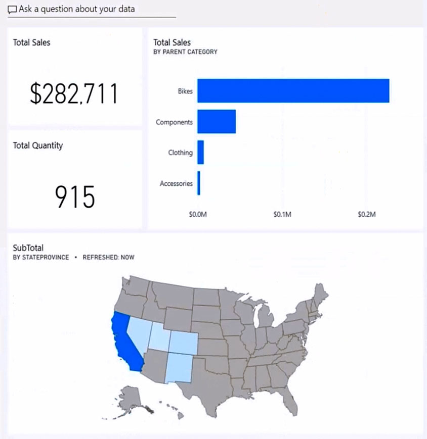
You need to ensure that when users view the dashboard on a mobile device, the dashboard appears as shown in the Mobile exhibit. (Click the Mobile tab.)

diagram

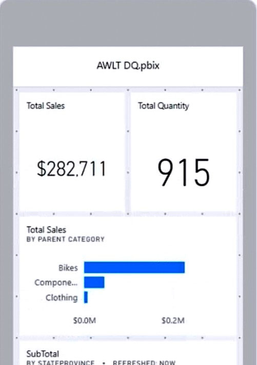
What should you do? To answer, select the appropriate options in the answer area. NOTE: Each correct selection is worth one point. Hot Area:

Teil 1:

Update the layout in the: Dashboard mobile layout

Yes. You must update the *Dashboard mobile layout* because the requirement is explicitly about how the dashboard renders on a mobile device. In Power BI, dashboards have a dedicated mobile layout editor in the Power BI service that lets you choose which tiles appear on mobile and how they are arranged. Without editing the dashboard mobile layout, the mobile app will either use an automatic/default tile flow or an existing mobile layout that may not match the desired design. The Mobile exhibit shows a deliberate arrangement (two KPI tiles side-by-side, then the bar chart, then the map), which is exactly what the dashboard mobile layout is intended to control.

Teil 2:

Update the layout in the: Dashboard web layout

No. You do not need to update the *Dashboard web layout* because the goal is only to control the appearance on mobile devices. The web layout is what users see in a browser and is independent of the dashboard mobile layout. Power BI allows you to keep the web layout optimized for large screens (as shown in the Dashboard exhibit) while separately designing a mobile-friendly layout. Changing the web layout would be unnecessary and could negatively impact the desktop/browser experience without providing additional benefit for the mobile requirement.

Teil 3:

Update the layout in the: Report mobile layout

No. You do not need to update the *Report mobile layout* because the visuals shown are on a *dashboard* (tiles pinned from reports), not a report page being viewed directly. Report mobile layout is configured in Power BI Desktop for report pages and affects how a report page renders in the mobile app when users open the report. However, when users open a dashboard in the mobile app, the dashboard’s own mobile layout rules apply. Therefore, editing report mobile layout would not ensure the dashboard appears like the Mobile exhibit.

Teil 4:

Resize and move: The SubTotal map tile

Yes. The SubTotal map tile must be resized and moved in the dashboard mobile layout to match the Mobile exhibit. On the web dashboard, the map is wide and placed across the bottom. On mobile, the available width is limited, and the exhibit shows the map positioned below other tiles in a vertical flow. To achieve that exact placement and sizing, you must explicitly drag and resize the map tile within the dashboard mobile layout editor. If you don’t, the map may appear too large, too small, or in an unintended order relative to the KPI and bar chart tiles.

Teil 5:

Resize and move: The Total Sales and Total Quantity tiles

Yes. The Total Sales and Total Quantity tiles must be resized and moved in the dashboard mobile layout. The Mobile exhibit shows these two KPI tiles aligned side-by-side at the top, each occupying roughly half the screen width. This is not guaranteed by default behavior; it requires manual placement and sizing in the mobile layout grid. If you leave them unmodified, they may stack vertically or appear in a different order/size, which would not match the required mobile appearance.

Teil 6:

Resize and move: The Total Sales by Parent Category tile

Yes. The Total Sales by Parent Category tile must be resized and moved in the dashboard mobile layout. In the web layout, it appears to the right of the KPI cards. In the Mobile exhibit, it is placed below the KPI cards and resized to fit the narrower mobile canvas. Achieving that specific arrangement requires editing the dashboard mobile layout and adjusting the tile’s position and dimensions. Without resizing/moving it, the chart could be truncated, appear in the wrong sequence, or consume an inappropriate amount of vertical space.

8
Frage 8
(2 auswählen)

You have a report that contains three pages. One of the pages contains a KPI visualization. You need to filter all the visualizations in the report except for the KPI visualization. Which two actions should you perform? Each correct answer presents part of the solution. NOTE: Each correct selection is worth one point.

Incorrect. While it sounds plausible, Power BI interaction settings are typically configured by selecting the source visual (the slicer) and then setting how it affects other visuals. You don’t generally solve slicer-exclusion requirements by editing interactions starting from the KPI visual. The practical and exam-expected approach is to edit interactions of the slicer.

Correct. A slicer affects only the current page unless you use Sync slicers. Adding the same slicer to each page and configuring Sync slicers ensures the selection is applied consistently across all three pages, meeting the requirement to filter the report’s visuals across pages (subject to excluding the KPI via interactions).

Correct. To prevent the KPI from being filtered while other visuals are filtered, you must edit the interactions of the slicer on the KPI’s page. Set the KPI visual interaction to “None” and keep other visuals set to “Filter.” This is the standard method to exclude a single visual from slicer effects.

Incorrect. A page-level filter applies to all visuals on that page, including the KPI. It cannot be configured to exclude a specific visual. It also would not automatically apply to the other pages, so it fails both the scope requirement and the KPI exception requirement.

Incorrect. A report-level filter applies to all pages and all visuals in the report, including the KPI. It cannot exclude a single visual. This option meets the “all pages” scope but fails the “except for the KPI visualization” requirement.

Fragenanalyse

Core concept: This question tests Power BI filtering behavior across report pages and how to exclude a specific visual (the KPI) from being affected by a slicer. The key features are Sync slicers (to apply the same slicer selection across multiple pages) and Edit interactions (to control whether a slicer filters a given visual). Why the answer is correct: To filter all visualizations in the report, you need a filter mechanism that applies consistently across all three pages. A slicer normally affects only visuals on its current page. Therefore, you add the same slicer to each page and use Sync slicers so that a single selection is applied across pages (Option B). However, the requirement says “filter all the visualizations in the report except for the KPI visualization.” That exception must be handled at the visual interaction level: on the page that contains the KPI, you edit the interactions of the slicer and set the KPI visual to “None” (no filtering) while leaving other visuals as “Filter” (Option C). Key features and configuration details: - Sync slicers: In the Sync slicers pane, you can choose which pages the slicer syncs to, and optionally whether it is visible on each page. This ensures consistent filtering across pages without relying on separate, independent slicers. - Edit interactions: With the slicer selected, use Format ribbon > Edit interactions, then for the KPI visual choose the “None” icon so the slicer does not affect it. Common misconceptions: - Report-level or page-level filters (Options D/E) apply broadly and cannot exclude a single visual; they would also filter the KPI, violating the requirement. - Editing interactions of the KPI visual itself (Option A) is not the typical control point for slicer-to-visual behavior; interactions are configured from the filtering visual (the slicer) to the target visuals. Exam tips: When you see “exclude one visual from a slicer/filter,” think Edit interactions. When you see “apply slicer across pages,” think Sync slicers. Report/page filters are for broad scope and do not support per-visual exceptions.

9
Frage 9

A business intelligence (BI) developer creates a dataflow in Power BI that uses DirectQuery to access tables from an on-premises Microsoft SQL server. The Enhanced Dataflows Compute Engine is turned on for the dataflow. You need to use the dataflow in a report. The solution must meet the following requirements: ✑ Minimize online processing operations. ✑ Minimize calculation times and render times for visuals. ✑ Include data from the current year, up to and including the previous day. What should you do?

DirectQuery mode against the dataflow would cause visuals to generate queries at interaction time, increasing online processing operations and typically slowing calculations/rendering compared to Import. While the Enhanced Compute Engine can help, DirectQuery still depends on query execution at view time and can be impacted by gateway latency and source performance. It also doesn’t inherently enforce the “up to yesterday” requirement without additional filtering logic.

This adds a gateway configuration, which is commonly required for on-prem connectivity, but it still uses DirectQuery. That conflicts with the requirement to minimize online processing operations and to minimize calculation/render times, because each visual interaction can trigger queries through the gateway to SQL Server. The gateway requirement doesn’t improve performance; it just enables connectivity. Import is typically the performance-optimized approach here.

Import mode loads the data into the dataset’s in-memory engine (VertiPaq), which generally provides the fastest DAX calculations and visual rendering and minimizes online operations during report usage. Scheduling a daily refresh meets the freshness requirement of including data through the previous day. This is the best match for performance and reduced online query load while satisfying the time window requirement.

Hourly refresh via Power Automate increases processing operations and is unnecessary because the requirement only needs data up to and including the previous day. More frequent refreshes increase capacity load, refresh duration risk, and gateway usage without providing business value for this requirement. It also doesn’t inherently improve visual performance beyond what Import already provides; it mainly increases freshness.

Fragenanalyse

Core concept: This question tests how to consume a Power BI dataflow (built on an on-premises SQL source) in a report while optimizing performance and reducing online query workload. It also touches the Enhanced Dataflows Compute Engine, which can accelerate transformations and support DirectQuery over dataflows, but does not automatically make DirectQuery the best choice for report performance. Why option C is correct: To minimize online processing operations and minimize calculation/render times, you should use Import mode for the dataset. Import mode loads data into the VertiPaq in-memory engine, which is typically far faster for DAX calculations and visual rendering than DirectQuery, because visuals do not need to send queries back to the source for each interaction. Scheduling a daily refresh aligns with the requirement to include data from the current year up to and including the previous day (yesterday). A daily refresh (e.g., early morning) ensures the dataset contains data through yesterday without needing near-real-time querying. Key features and best practices: - Import mode leverages VertiPaq compression and in-memory execution, improving report interactivity and reducing dependency on the on-prem SQL server and gateway during user activity. - A daily scheduled refresh is sufficient for “up to and including the previous day.” You can further reduce refresh cost by filtering the dataflow/query to current year only, and optionally using incremental refresh on the dataset if volume is large. - Enhanced Dataflows Compute Engine can speed up dataflow processing, but the report performance requirement is best met by Import. Common misconceptions: DirectQuery (including DirectQuery to dataflows) can seem attractive because it avoids refresh and shows near-real-time data. However, it increases online operations (queries at view time) and often slows visuals due to source latency, concurrency limits, and gateway overhead. Exam tips: When requirements emphasize minimizing visual render time and calculation time, default to Import unless near-real-time data is explicitly required. When the freshness requirement is “through yesterday,” a daily refresh is usually the intended solution. Also remember: DirectQuery to on-prem sources typically requires an on-premises data gateway, and it shifts workload to the source during report usage.

10
Frage 10

You have a Power BI tenant. You have reports that use financial datasets and are exported as PDF files. You need to ensure that the reports are encrypted. What should you implement?

Microsoft Intune policies focus on device management (MDM) and mobile application management (MAM), such as requiring PINs, controlling copy/paste, or enforcing conditional access on managed devices. While Intune can reduce data leakage on endpoints, it does not natively apply encryption/rights management to Power BI-exported PDF files based on report classification. It’s not the primary control for encrypting exported documents from Power BI.

Row-level security (RLS) restricts which rows of data a user can see in a dataset/report by applying DAX filter rules per role/user. RLS is effective for limiting data visibility within Power BI and during queries, but it does not encrypt content. If a user can export a report they are authorized to view, RLS won’t add encryption to the resulting PDF; it only affects what data is included.

Sensitivity labels (Microsoft Purview Information Protection) provide classification and protection for Power BI content. When configured with encryption/rights management, labels can ensure exported files (like PDFs) are protected according to the label’s policy (who can open, print, copy, etc.). This directly meets the requirement to ensure exported financial reports are encrypted and supports consistent governance across Microsoft 365 and Power BI.

Dataset certifications (endorsements such as Certified/Promoted) are governance features that indicate a dataset is trusted and curated. They help users discover authoritative data sources and improve reuse, but they do not apply encryption, access restrictions, or rights management to reports or exported files. Certification is about trust and metadata, not security controls for exported PDFs.

Fragenanalyse

Core concept: This question tests Power BI information protection for exported content. In Power BI, encryption and usage restrictions for exported files (such as PDF) are achieved through Microsoft Purview Information Protection (MIP) sensitivity labels applied in Power BI. Why the answer is correct: Sensitivity labels allow you to classify and protect Power BI content (datasets, reports, dashboards) and enforce protection when content is exported. When a report is exported to PDF and the label is configured for encryption/protection, the exported PDF can be encrypted and have rights management controls applied (for example, restricting who can open, print, copy, or forward). This aligns with the requirement: “reports… exported as PDF files” and “ensure that the reports are encrypted.” Key features / how it works: - Enable sensitivity labels in the Power BI tenant settings and integrate with Microsoft Purview. - Publish and apply labels to reports (manually or via policies, depending on your organization’s configuration). - Configure the label in Purview to apply encryption (Azure Rights Management) and usage rights. - When users export labeled content, the exported file inherits the label’s protection settings (subject to supported export scenarios and client capabilities). This supports the Azure Well-Architected Framework security pillar by enforcing data classification, least privilege, and protection of data at rest and in transit—especially when data leaves the service boundary via export. Common misconceptions: - RLS is often confused with “security,” but it only filters data per user inside the model; it does not encrypt exported PDFs. - Intune manages devices and app protection policies; it doesn’t provide document-level encryption for Power BI exports. - Dataset certification is governance/endorsement, not protection. Exam tips: For PL-300, remember: classification and encryption of Power BI artifacts and exports maps to sensitivity labels (Purview/MIP). If the question mentions “export,” “PDF,” “Excel,” “protect,” “encrypt,” or “watermark/rights,” think sensitivity labels rather than RLS or endorsement features.

Weitere Übungstests

Practice Test #1

50 Fragen·100 Min.·Bestehen 700/1000

Practice Test #2

50 Fragen·100 Min.·Bestehen 700/1000

Practice Test #4

50 Fragen·100 Min.·Bestehen 700/1000

Practice Test #5

50 Fragen·100 Min.·Bestehen 700/1000
← Alle PL-300: Microsoft Power BI Data Analyst-Fragen anzeigen

Jetzt mit dem Üben beginnen

Lade Cloud Pass herunter und beginne alle PL-300: Microsoft Power BI Data Analyst-Übungsfragen zu üben.

Get it on Google PlayDownload on the App Store
Cloud PassCloud Pass

IT-Zertifizierungs-Übungs-App

Get it on Google PlayDownload on the App Store

Zertifizierungen

AWSGCPMicrosoftCiscoCompTIADatabricks

Rechtliches

FAQDatenschutzrichtlinieNutzungsbedingungen

Unternehmen

KontaktKonto löschen

© Copyright 2026 Cloud Pass, Alle Rechte vorbehalten.

Möchtest du alle Fragen unterwegs üben?

App holen

Lade Cloud Pass herunter – mit Übungstests, Fortschrittsverfolgung und mehr.